Showing posts with label multpl. Show all posts

Thursday, January 9, 2020

Housing update: Case Shiller National Home Price Index hit 212 in October 2019, 51% above 140

The Case Shiller National Home Price Index hit 212 in October 2019, 51% above 140. The full data at the new iteration of the index since February 2018 is behind a registration wall. 

The 140 level was the level around which the index tracked for most of the post-war until the year 2000, in a range between 120 and 160.

Since then it's been as high as 235 in 2005 and 2006 during the housing bubble, and as low as 151 in February 2012 after the bubble sort-of popped. A real correction might have taken prices to 120 or even below.

Clearly the index never returned to the post-war experience, which was mostly slightly below 140. Keeping housing prices high became a Federal Reserve objective and bragging point after the Great Financial Crisis of 2008, achieved by manipulating interest rates lower.

The median sales price of an existing home in the US is currently $271,300 through November 2019, a price which is traditionally considered affordable to any individual making $104,346 per year and up.

Seeing that's just 8.5% of individual wage earners in 2018, the median sales price of an existing home is currently UNAFFORDABLE to 91.5% of wage earners.

Most people have to put together two incomes to afford such a house. But in a country where the median wage is south of $33,000 per year in 2018, two incomes only gets you to $66,000, which affordably buys you a house worth about $171,600 or so, $100,000 less than the current median sales price.

In my immediate vicinity, there's exactly two such single family homes on the market right now which are affordable to a couple making $66,000. Everything else costs much, much more.

This is a picture of declining equal opportunity.

Wednesday, December 18, 2013

John Hussman Is Right: High Valuations Since The Late 1990s Have Coincided With Smaller S&P500 Returns

Here's Hussman:

Yes, several reliable valuation measures have hovered at much higher levels since the late-1990’s than were generally seen historically. But that in itself is not evidence that these historically reliable valuation measures are “broken.” It matters that those high valuations have been associated with a period of more than 13 years now where the S&P 500 has scarcely achieved a 3% annual total return.

Here's Ironman's chart of S&P500 returns for the 15 years ended October 2013 showing a real, that is inflation-adjusted, total annual return with dividends fully reinvested of . . . 2.88%:

click to enlarge


Here's Morningstar's chart showing how much better you'd have done in intermediate term bonds like Vanguard's VBIIX, 5.88% nominal per year over the last 15 years (roughly 3.4% real), and that's including this year's bond slaughter:

click to enlarge


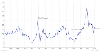
Here's the Shiller p/e as of this morning, clearly and excessively above the mean level of 16.50 for most of the time from the 1990s:

click to enlarge


Hussman says investors should expect poor returns from stocks going forward:

[S]tocks are currently at levels that we estimate will provide roughly zero nominal total returns over the next 7-10 years, with historically adequate long-term returns thereafter.

Monday, July 29, 2013

Home Prices Still Too High: Nationally 24% Pay More Than Half Their Income On Housing

Case Shiller Home Price Index @multpl.com
Joel Kotkin reflects on the still expensive housing market here:


Ownership levels continue to drop, most notably for minorities, particularly African Americans. Last year, according to the Harvard study, the number of renters in the U.S. rose by a million, accompanied by a net loss of 161,000 homeowners.

This is bad news not only for middle-income Americans but even more so for the poor and renters. The number of renters now paying upward of 50% of their income for housing has risen by 2.5 million since the recession and 6.7 million over the decade. Roughly one in four renters, notes Harvard, are now in this perilous situation. The number of poor renters is growing, but the supply of new affordable housing has dropped over the past year. ...


According to the Center for Housing Policy and National Housing Conference, 39% of working households in the Los Angeles metropolitan area spend more than half their income on housing, 35% in the San Francisco metro area and 31% in the New York area. All of these figures are much higher than the national rate of 24%, which itself is far from tolerable.


-------------------------------------------------

Kotkin nowhere mentions that currently expensive housing is explicit Federal Reserve policy. ZIRP and QE are specifically designed to reduce long term interest rates to make home mortgages affordable. Instead those policies have re-inflated housing prices to their historical highs before the bubble and reversed the downward trajectory of price resetting those prices were on.

In June 2013 dollars, the Case Shiller Home Price Index reached its low point after the bubble at 126.30 for the quarter ended March 31, 2012. That level hadn't been seen since June 1998. But from the long term perspective prices should have reset to 120 on the index or lower as they have in the past. This expectation holds even more considering the excesses of the bubble which needed to be wiped out, but haven't been.

The Fed has done nothing but interfere with the free market in housing, creating the bubble in the first place and preventing its deflation now. To fix the problem, the Fed needs at a minimum to focus solely on price stability by maintaining a strong dollar. Markets will take care of themselves after that.

Wednesday, May 8, 2013

Cyclically-Adjusted p/e Above 20 Forecasts Near-Zero 10yr Returns

As discussed here by Mark Hulbert:


Where does the CAPE stand today?

It currently is at 23.3, which is 41% higher than its historical average. While the CAPE’s current level is not as high as the 40+ readings that were registered at the top of the internet bubble, it does not bode well for the next ten years. On average over the last century, the S&P 500 has produced a 10-year inflation-adjusted return of close to zero whenever the CAPE has been above 20.

To be sure, note carefully that this is a 10-year forecast. Even if it turns out to be accurate, it doesn’t mean the market will decline in a straight line between now and 2023. It wouldn’t be inconsistent with this forecast for the market’s impressive recent rally to continue for a while longer, for example.

politicalcalculations.blogspot.com
Hulbert is right. On March 1, 2000 the Shiller p/e stood at 43.22. For the thirteen years from March 2000 to March 2013, your return in the S&P500, adjusted for inflation and with all dividends re-invested, as been exactly +0.05% per annum.

Sort of like investing in a money market fund right now.

Ouch.

By the way, the Shiller p/e this morning stands at 24.14.


Wednesday, January 23, 2013

Latest Real Case Shiller Home Price Index Shows Prices Top Of Range Pre-Bubble

If you take out the obvious housing bubble, the graph shows how prices for housing today are at the upper range of historical experience when adjusted for inflation. These are prices in December 2012 dollars going back to 1890, over 120 years. It doesn't get more current than that. Housing assets are still expensive on this showing, about 12% too expensive, imho. Price discovery is being impeded by Federal Reserve zero interest rate policy. See the graph here.

Monday, January 14, 2013

Housing Prices Rise To Within 3% Of Pre-Bubble 20th Century Highs

Housing prices according to the Case-Shiller Housing Price Index for the 3rd quarter of 2012 here have clawed their way back to within 3% of the 20th century's historic high before the housing bubble.

The index has climbed in 2012 from 124.48 at the end of March to 132.97 at the end of June, and now sits at 134.97 as of the end of September 2012, a rise of 8.4% in just six months.

Prices at this level are high by historical standards, if one ignores price action during the housing bubble. Excepting that period, the high water mark for housing prices in the 20th century was reached on Sep 30, 1989 at the level of 138.54 on the index, 8 years before the tax law was changed to make it possible to churn real estate capital every 2 years, which was the real fuel for the housing bubble.

From the 1950s right up to the end of 1997, prices on the index hewed closely to 120, rising above that level and below it in a cyclical manner in the absence of meddling with housing and tax law. But after 1997 prices became unhinged and rapidly increased, shooting above the upper range limit of 140 in September 2000 on their way to the bubble peak of 218.72 in December 2005. We all know the sorry aftermath of that.

Today prices for housing assets are very high by historical standards. The new fuel for them is Federal Reserve zero interest rate policy, which represents violent meddling with interest rate markets designed in part to help homeowners refinance existing mortgages and buyers buy at affordable rates. This is surely frustrating and destructive at the same time, as any person without a job needing to refinance and any person needing interest income can tell you.

While it is difficult to predict what the new normal should look like with respect to future housing price trends as the market adjusts to the exploded bubble and current housing policy and tax laws, prices supported by federal manipulation cannot be real.

The country desperately needs a free market in housing, but it doesn't have one.

Sunday, September 16, 2012

Case-Shiller Home Price Index Updated For 2012 At Multpl.com: Dead Cat Bounce

The Case-Shiller Home Price Index at multpl.com has been updated for Q1 and Q2 2012, showing the housing nadir at 124 in March 2012, from which as of the end of June the increase is 6.8 percent to 133.

See the chart and tables here.

I don't believe it is anything but a dead cat bounce, which may indeed go higher because of QE3, but it is not the sign of a fundamental change like the one which occurred in 1997, nor for that matter like the one in the immediate aftermath of WWII. Housing values remain in the high range of historical post-war experience and need to fall further.

Obama has had no commitment to fixing housing, playing around the edges of the issue, and Romney plans to do nothing but let the market fix it, which is probably the best thing to do, as long as he doesn't fiddle with current tax arrangements affecting housing.

The tax changes introduced in 1997 need to find their equilibrium without more interference. The federal government needs to firmly express its commitment to all current tax arrangements affecting housing, including the mortgage interest deduction, in order to calm the housing market and give homeowners, buyers, sellers and financiers the confidence to move forward on a solid basis.

Markets hate uncertainty about rules! 

Tuesday, August 21, 2012

"Valuations Remain Unusually Rich"

So says John Hussman, here:


Valuations remain unusually rich on our measures . . . it should be of some concern (though it is clearly not) that the price/revenue multiple of the S&P 500 is now above any level seen prior to the late-1990’s market bubble. Prior to that time, the highest post-war peaks were in 1965 (which was not followed by a deep or immediate decline, but marked the onset of what would ultimately become a 17-year secular bear market), and 1972, just before the S&P 500 lost nearly half of its value.

The Shiller p/e bears him out (esp. the post-war peak on January 1, 1966 at 24.06 vs. nearly 23 today, and the post-war nadir of 6.64 in July/August 1982, a 72 percent decline in valuation over the course of the secular bear and the mother of all buying opportunities since the war):


The price for performance remains steep.

Monday, June 4, 2012

Housing Prices Need Not Increase, Just Remain Stable, For Economic Recovery

So says Harvard's Edward Glaeser for Bloomberg.com here:

The 1990s offer us one upbeat message. Housing prices stayed static for six long years after 1991, and in real terms, housing prices were no higher in 1998 than they were in 1991. Yet real GDP grew an impressive 28 percent between 1991 and 1998. It’s a myth that the housing market must recover before the larger economy can surge.

Not quite.

The average Case Shiller Home Price Index for 1991 was 125.55, and was 125.10 for 1998, but the chart for the period was flat to slightly declining, until the provisions of the Taxpayer Relief Act of 1997 helped begin the housing bubble. Prices reached a nadir for the period in 1996 at 117.64, a decline of over 5 percent from 1991.

Friday, June 1, 2012

The Shiller p/e Will Have To Get Much Lower Than This Before We Can Talk Of Capitulation

Capitulation means a multiple between 5 and 10, and assumes a complete lack of interest in stock investing. Tonight's multiple is still quite elevated above 20:


(This post replaces a previous one containing erroneous information about the Shiller p/e and has been deleted).

Tuesday, May 29, 2012

Case Shiller Home Price Index Falls To 128.13 Through 12/31/11


And everyone's happy for some reason.

When you consider that the mean for the whole history of the index is 123 and the median 120, which include the irrational exuberance of recent history, today's new low of 128 after this massive, outlier, bubble merely looks like more progress in the direction of regression toward the mean, not a "bottom" as many are saying. Indeed, the historical mean implies we have a fair way DOWN to go in price, to say nothing of the very real possibility of overshooting that to the downside.

The quarterly index, adjusted for inflation, has now hit today's level eight times in the post-war period:

Dec. 31, 2011 128.13
Mar. 31, 1999 128.40
Dec. 31, 1990 128.27
Dec. 31, 1979 128.78
Sep. 30, 1978 128.22
Dec. 31, 1955 128.21
Mar. 31, 1955 128.15
Dec. 31, 1954 128.30.

There's enough history between 110 and 130 to suggest that "normal" is still somewhere south of 128.


Take two aspirin every morning and call me in ten years.

Go here for the chart.

Sunday, February 19, 2012

Wednesday, December 7, 2011

Home Prices Are Still At The Top Of Their Historical Range Before The Bubble

Note the inflation-adjusted similarity of the current index value to the late 1980s and the late 1970s. 

This means prices could continue to fall at least another 7-8 percent from April 2011 levels, and easily overshoot to the downside as the imbalances continue to correct.

And it could take a very long time.


Sunday, October 23, 2011

Rep. Newt Gingrich Gets Blame For Housing Legislation Which Led To Bubble

Rep. Newt Gingrich was instrumental in turning the American dream into the American nightmare.

Under Gingrich's leadership in the US House as Speaker he spearheaded the drive to turn our homes into a mere commodity which could be flipped over and over again free of capital gains tax. And as everyone now knows only too well, commodities go up, and commodities go down.

From his Wikipedia entry:

In 1997 President Clinton signed into effect the Taxpayer Relief Act of 1997, which included the largest capital gains tax cut in U.S. history. Under the act, the profits on the sale of a personal residence ($500,000 for married couples, $250,000 for singles) were exempted if lived in for at least 2 years over the last 5. (This had previously been limited to a $125,000 once-in-a-lifetime exemption for those over 55.) There were also reductions in a number of other taxes on investment gains. Additionally, the act raised the value of inherited estates and gifts that could be sheltered from taxation. Gingrich has been credited with creating the agenda for the reduction in capital gains tax, especially in the "Contract with America", which set out to balance the budget and implement decreases in estate and capital gains tax. Some Republicans felt that the compromise reached with Clinton on the budget and tax act was inadequate, however Gingrich has stated that the tax cuts were a significant accomplishment for the Republican Congress in the face of opposition from the Clinton administration.


Look what happened to housing in 1997 after the legislation became law according to the Shiller index:


After four decades of relative price stability in real terms, the dramatic tax change Gingrich championed helped develop one of the most notable bubbles in American history, as well as a banking crisis and unemployment the likes of which we haven't seen since the 1930s.

Sunday, October 16, 2011

Is The Price of Owning the S&P500 Low, or High?

Everything depends on how you calculate the price.

This way, where the financial crisis in 2007-2008 represents the all-time high:


Or Shiller's way, where the peak was way back in 1999:

Friday, October 7, 2011

S&P 500 Close at 1155, 26 Percent Off the October 2007 High

For technical analysts, such a datum signifies that we are in a long term bear market since at least 2007 because the decline persists below 20 percent.

Today the Shiller p/e ratio is 19.79, shown here:

314 percent higher than the all-time low in 1920;

25 percent higher than the median;

20.5 percent higher than the mean;

and 55 percent lower than the all-time high in 1999 -- when a child was born somewhere, to mark that occasion, I am sure. Think of that: To be born at the height of irrational exuberance. I know such a person, but I didn't know the fact at the time.

A crash in the p/e ratio from here to the historical nadir would mean a collapse of nearly 76 percent.

Unthinkable? No. It is not necessary for such a crash to occur from a great height in the p/e ratio.

The collapse to the nadir in 1920 was from a p/e ratio lower than 25, as was nearly the case also in the early 1980s.

Price, and condition, that's all that matters, says the realtor. So should we all say. 

Thursday, September 22, 2011

So, You Think You Should Buy On This Dip?

The Shiller S and P price to earnings ratio stands tonight at 19.42, as here, still way above the historic middling 16.

I can remember people calling it the buying opportunity of a lifetime, at around 15, in March 2009. Why isn't this the selling opportunity of a lifetime?

The S and P is down over 10 percent year to date, down less than one-half of one percent in the last 12 months when QE II got underway, and down 14 percent in the last five years despite QE I and II. Not counting (negligible) inflation on the negative side, nor (declining) dividends on the positive side.

Since 1881 opportunities to sell around 20 outnumber opportunities to buy around 10, but not by much: the ratio is roughly 11 to 9, in my post-prandial bliss.

This is still a selling opportunity.

Wednesday, September 14, 2011

Can No One Tell The Truth, Even About The Great Depression?

Seen here:

Between 1929 and 1933, U.S. gross domestic product contracted by around 30%.

Where the hell does that come from?

In 1929 GDP was $103.6 billion. By the end of 1933 GDP had declined to $56.4 billion. That's a decline of over 45 percent, not "around 30 percent."

Matthew Lynn for Marketwatch.com is talking about "the buying opportunity of a lifetime" at the link.

Really? With the Shiller price-to-earnings ratio at 20.43?

The buying opportunity of my lifetime was between 1973 and 1983, when the Shiller p/e ratio rattled around 10, fifty percent lower than it is today. And it just so happens that I didn't have any money to invest in those years like I do today because of a lifetime of saving.

Not even March 2009 was the buying opportunity of a lifetime, when the Shiller p/e fell to around 15.

If you are wise you will keep your powder dry until you see the whites in their eyes, so to speak, when we get to 10. But even then, can you live with yourself if you pull the trigger and then a total market collapse like 1929 brings the p/e closer to 5?

Well, can ya?

Remember the one true thing of Keynesianism: markets can stay irrational longer than you can stay solvent. A decline from 10 to 5 can wipe out 50 percent of what you have.

There is nothing which cannot repeat itself, because human nature does not change.

Friday, September 9, 2011

The Shiller S and P 500 Price to Earnings Ratio Stands at 19.84

As reported here.

1974 to 1984 was one hell of a buying opportunity by comparison.

Sunday, September 4, 2011

Shiller S and P 500 Price to Earnings Ratio Stands at 20.18 as of 09.02.11

Track it here:


Buttonwood provides a defense of it here.